I've actually watched the Yume Tsukai anime first. Because I enjoyed it, I took a look at the manga version which is quite different.
The anime has a different "case" nearly each episode (although there's a plot ongoing in the background throughout and climaxes during the last two episodes). It's still surreal and stuff, but the manga has a higher "weirdness level" to me (and one case could last over a volume). The really detailed backgrounds, mechanical beings and other weird creatures contrast so much with the simple style the humans themselves were drawn in. I also found the stories in the manga more "strange" than the ones in the anime, but I won't go into that.
I guess I'm actually quite attracted to some forms of surrealism, even if they're mainly those in anime or manga (since I'm frankly not interested in art in general).
There's this mysterious quality to them that's hard to put in words. That's the beauty of art, I suppose.
Thursday, 15 August 2013
Tales of Xillia artbook
Some concept art of Milla Maxwell, the heroine of the game. The in-game portraits were also included in this book, but I was more interested in these kinds of designs since I don't get to see them in the game. It makes getting the artbook more worth it. Besides having all the main characters, the side characters (even some minor ones) were also included and that's wonderful! I find it disappointing if they only have a few select characters. There are some minor characters that I like as well.
Besides the character designs, there are a bunch of environment concept art. Environment concept art usually amazes me. All that depth and detail...it's really amazing. Xillia's a fantasy game, that has some areas and cities that are more similar to the real and modern world (reminds me of some European cities). I like those kinds, so it's nice to see these environment art included.
There's also these two pages which have a bunch of magic symbols, such as the magic circles that appear when a spell is being cast. I think that it's pretty neat. (and magic circles are awesome)
The main selling point of this limited Collector's Edition is supposedly the Milla figure. I think that it's sculpted pretty well, capturing her immense hair volume quite nicely as well as her body line. It has been modelled based on one of her official art.
A beautiful addition to my desk.
I hope to be able to one day create proper concept art for my own characters and maybe even do environment illustrations (I loathe drawing backgrounds so this will be a horrible challenge). But what I want even more is to be able to make figures of said characters. Being able to hold the character in real life is an amazing feeling.
Saturday, 10 August 2013
Takoyaki box
Friday, 9 August 2013
Dancing cheese and chips
From a Pringles can. Just found it quite amusing, with the disco ball too. Sometimes being a bit absurd is good for humor and stuff, but sometimes it gets annoying and stupid instead. So when would be a good time to use ordinary images of potatoes lying and when to have silly dancing things?
Well, Pringles give off a fun vibe so I think that it suits it fine.
!National Day!
A drawing I did from 2009. Apparently I was really "patriotic" before.
Besides this horrible piece of work, I doubt that I have any other recent National Day-related drawings. Just wanted to have a post to celebrate this special date!
Besides this horrible piece of work, I doubt that I have any other recent National Day-related drawings. Just wanted to have a post to celebrate this special date!
Thursday, 8 August 2013
Contrasts
Puella Magi Madoka Magica, a highly popular anime that I ended up watching as well. The sketchy lines used with drawing the characters (especially the eyes)...they're quite unlike the usual "clean" look present in other anime. I like that raw feeling more than really clean lines, so I also tend to do the same when I do my own drawings. A certain degree of sketchiness versus clean lines (such as those needed in 2D fundamentals eeewww)
But the best and most defining part of Madoka Magica, in my opinion, are whenever the characters enter those labyrinths created by Witches. The style then changes (sometimes drastically) and each labyrinth has a different look. The clashing of the simple and cutesy characters against surreal backgrounds make the realms of "fantasy" and "reality" more dramatic and mysterious.
These images are from only one encounter, but because it's the first one, it's definitely one of the most memorable. Those puffy things with moustaches are really cute, although once they bring out the scissors and have visible eyes it might be nightmare fuel for some...
Wednesday, 7 August 2013
Brainstorming styles
Today's Creative Thinking lesson is about brainstorming. One thing that caught my attention wasn't the sometimes ridiculous ideas people thought of, but the different styles presented. Be it the various levels of neatness or the number of pictures used...
Even people doing the exact same problem end up with really different outcomes. And that was what I found most interesting~
Monday, 5 August 2013
Not vulgar
Testing blogger app on the phone...
Anyway.
Lines in the shape of a shooting p***s that I drew - and I don't care even if it was for school work.
Saturday, 3 August 2013
Couch
A drawing of my ex-couch from 2 years ago (drawing class homework). As much as I find drawing things like these really uninteresting, I feel that it's kind of easier than having to be "creative"...whatever being creative means.
I still despise still life drawing though.
I still despise still life drawing though.
Friday, 2 August 2013
A meaningful puzzle?
Saw this in Esplanade MRT station on the way to school today. A Singapore Cancer Society thing. I ended up trying to find words in it, and saw things like "LUNG", "LIVER" and other organs related to common cancer risk. Maybe it's because it's a puzzle, so it ended up drawing me to it compared to other posters and stuff.
Thursday, 1 August 2013
Not everything has to be coloured
Currently no idea for what picture to use today, so I'm just casually using two pages I just completed. The comic is supposed to be in full colour, but sometimes I'm lazy or actually felt that the scene has more impact being in black and white.
Sometimes black and white really fit a scene better than having colour (though I was told that colour is more appealing, which was the reason I'm doing the comic in colour in the first place.)
It's also quicker to complete.
So I was thinking of going back to black and white for future comics.
Not everything has to be coloured, I believe. Even if there are coloured parts, it doesn't mean that I can't have monochrome scenes, right?
Two at once...
...because my ideas usually come in bunches before the drought.
--
I usually eat Japanese snacks bought from Daiso. It has nothing to do with bias for Japanese stuff (I don't like sushi and sashimi and many other things) but one of the reasons: a large variety of flavours, including strange ones and not just the conventional ones like cheese, barbeque, etc etc.
I like takoyaki, and it makes me happy that this snack has a takoyaki flavoured type.
The large variety of flavours among snacks and sweets...it's all really interesting, but I probably won't even go near like...99% of them.
And this second picture is of two figurines I own. Their heads could be taken out. So that means I could switch their bodies around.
And so I made this teenage girl and adult working man switch bodies, resulting in things like the man wearing the female school uniform as well as having a ridiculous girly pose.
After all, there's nothing wrong with doing things like that. It makes things more interesting (for me, at least)...
Wednesday, 31 July 2013
Round 2 - start -
National Day is coming soon, and all those familiar decorations are popping up everywhere. But out of all of them that I've seen so far, this one in my neighbourhood caught my attention. They're apparently done by a bunch of students (but from where exactly, I don't know) and features a bunch of those things called Minions. From the Despicable Me movies which seem to be really popular recently.
I don't like them myself, but it's still amusing to see them in a National Day banner actually being displayed to the public. It's near a bus stop so it's hard to miss.
I don't like them myself, but it's still amusing to see them in a National Day banner actually being displayed to the public. It's near a bus stop so it's hard to miss.
Sunday, 28 July 2013
Lines
Devil Survivor 2 The Animation Vol.1 cover art.
Traumatized by 2D Fundamentals, so now line patterns are reminding me of 2D Fundamentals and its associated pain.
Saturday, 27 July 2013
Creative Concepts
2 pictures of something that's supposedly a Chingay float. There's Chingay festival in Singapore and there are street floats and stuff. This was a group work done in Creative Concepts module in Republic Polytechnic. I was a part of the group that did this, but I forgot the whole process(but if I remember correctly, the grass was one of the things I did) and why we made it look like this in the first place. I still find it looking really amusing though.
This work is not intended to offend anything or anyone.
This work is not intended to offend anything or anyone.
Thursday, 25 July 2013
Pictures from Japan trips
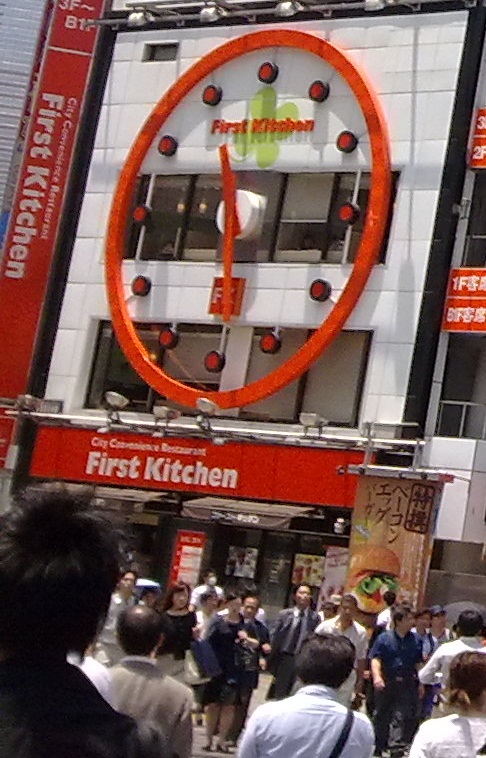
 During the first visit to Japan, I took many pictures. The number of pictures taken decreased during each subsequent trip, but I've always enjoyed looking around and seeing how the buildings and things were like. This picture is outside a fast food place called First Kitchen. This place is somewhere in Shinjuku, and not far from the hotel we stayed. I find it interesting because of that huge clock (and if I remember correctly, besides being aethetically interesting, it's functional and tells the time too). The building is situated in front of a crossing leading to Shinjuku station, so it's even more convenient.
These buildings are from Akihabara, which is famous for all of its anime and electronics. It's probably the only place one would see all these anime-related banners everywhere. It reminds me of that Tim Brown video, about security and familiarity. These banners would look out of place in Singapore and people won't be as comfortable seeing them. Also, the banner that I like the most is that big one with a huge skinless face(a titan). It's an advertisement on an anime called "Attack On Titan" so it's really clever of them making it big and high up on the building resembling the actual titans.
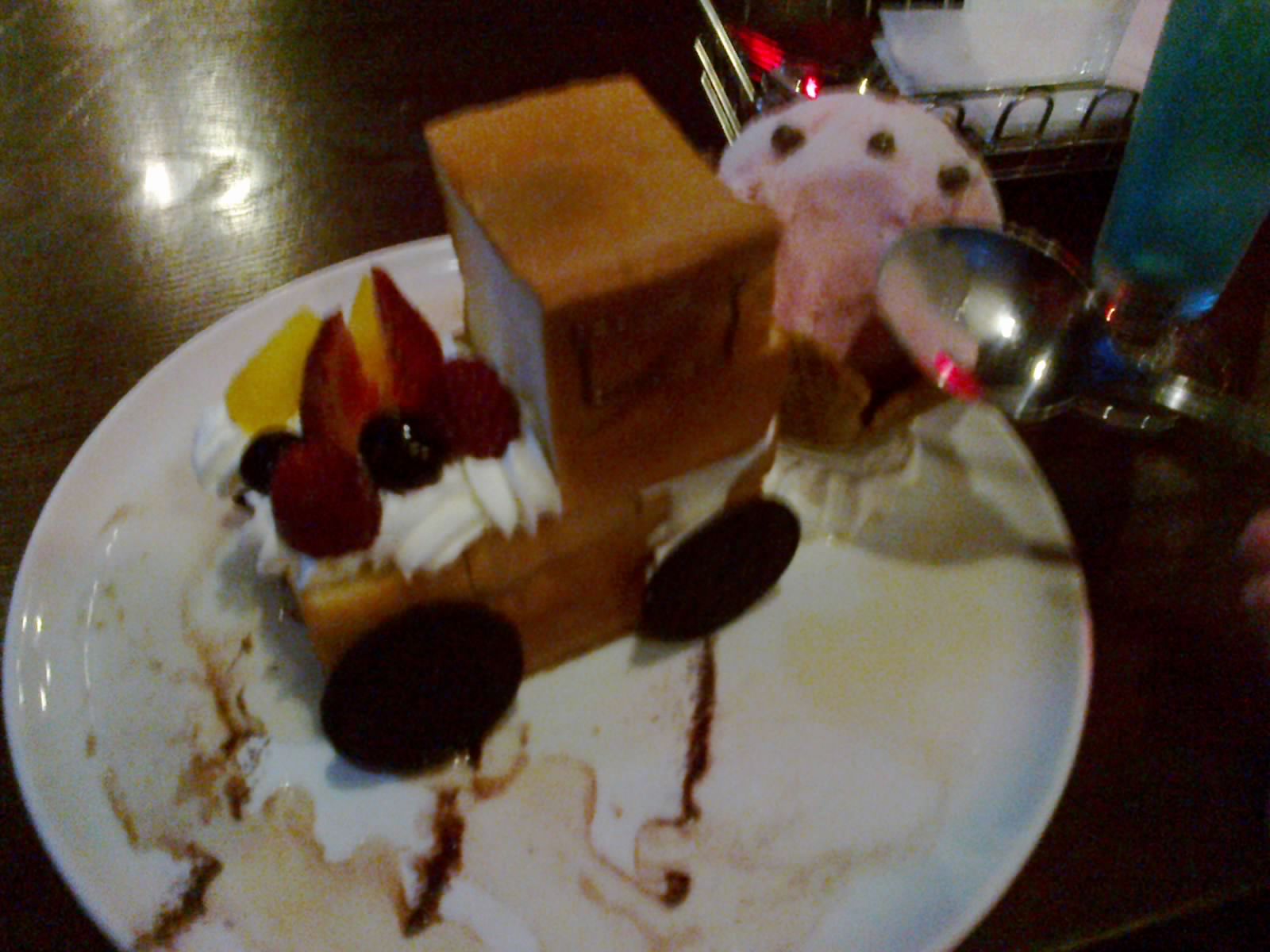
 And this is a photo of a "truck" and a monster that resembles an ice cream. This was from a themed cafe(in Akihabara too) featuring an anime called Devil Survivor 2. They were screening the first episode repeatedly, and in the actual episode, one of the characters used a truck to crash into the monster(which really looked like an ice cream in the show). When this dish was served, the person who served it even lit some of the syrup up with a little fire. I'm always amazed at the creations from these kinds of cafes. They're really creative and fun.
Wednesday, 24 July 2013
First post + TED video homework thing
Hi.
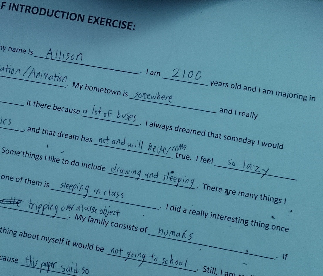
First random picture is a horribly cropped photo of the "Self introduction exercise" I did in class. It was actually the first time I'm doing such a thing, and I have to admit it was quite fun. Probably because I was filling it out with nonsense. They're actually true things, more or less.
Anyway, this blog is for the Creative Thinking module.
Following this, I will write things of the Tim Brown video in bullet point form while I actually play the video simultaneously. Everything else is after the cut~
Subscribe to:
Comments (Atom)


